How to Boost Local SEO Rank with Google Reviews? 2025
March 22, 2023
Best 2025 App Startup Ideas: 80+ Innovative Apps for Success.
January 25, 2024
How to Boost Local SEO Rank with Google Reviews? 2025
March 22, 2023
Best 2025 App Startup Ideas: 80+ Innovative Apps for Success.
January 25, 2024
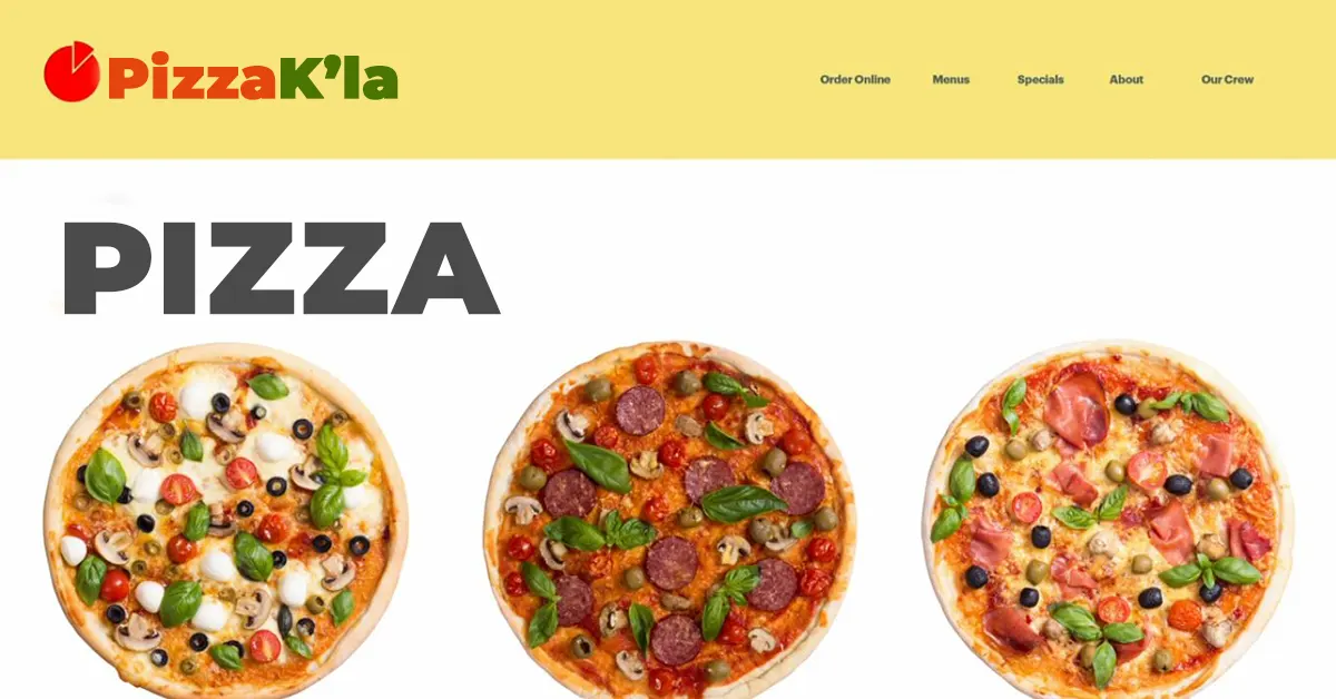
A POOR IMAGE & WORDS COMBINATION
When images and words are combined and there is no increase or change in meaning, the solution fails.
This is simply a caption. Used correctly, the words should never simply repeat what the image is saying.
This presumes the viewer doesn't have the intelligence to understand the image. I don't need to see both elements.
Principles of website design.
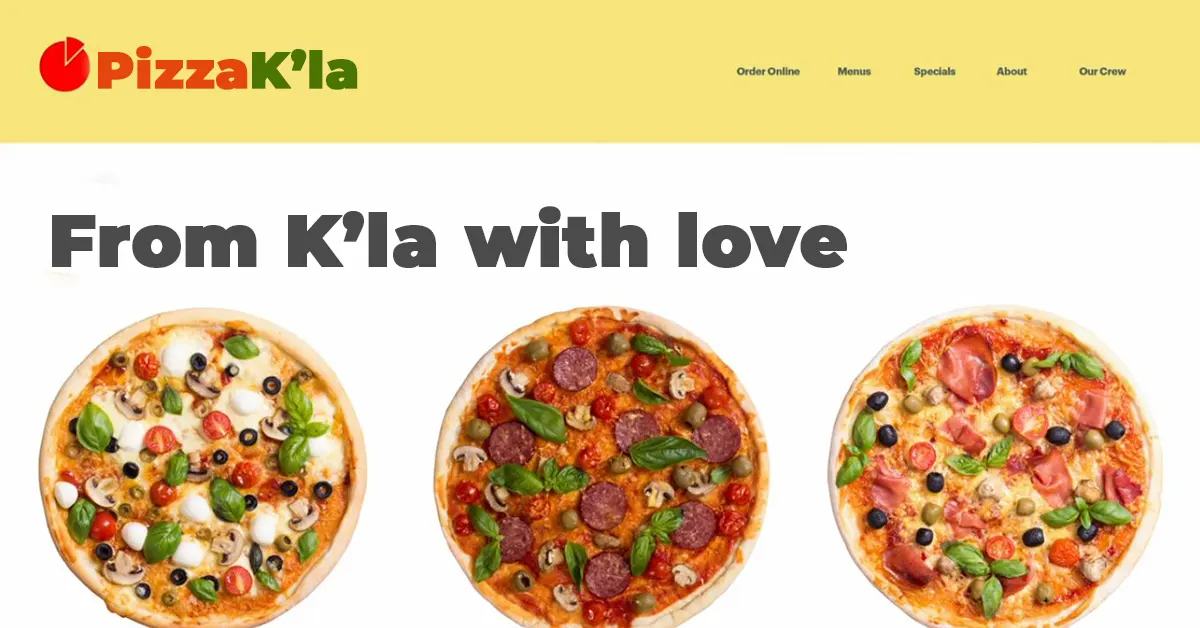
If I had chosen a lemon and added the word car, the lemon becomes a metaphor for the quality of a car. Images and words will always combine to change the meaning or enhance it. This is good. This gives you a larger set of tools to use.
A GOOD IMAGE AND WORDS COMBINATION
A good combination is a good symbiosis. Neither element can live alone. The image of a man falling from an upper floor is striking. It is unexpected. The frame is cropped with four quadrants and we are left with questions. The headline, "They Always Come Down," adds to the mystery as opposed to "Man Falls from Roof."
HOW DO WE EVALUATE A GOOD WEBSITE WITH A GOOD IMAGE AND TEXT RELATIONSHIP?
How we evaluate information is the basis of a good image and text relationship. We first look at an image and then any text that helps us understand the content. This couldn't be truer with online sites and apps that allow users to upload their own images. Applying colorful text that overlaps and highlights the images maintains the energy of consistency of the app.
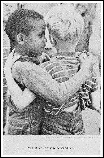
ONE OF OUR FAVORITE PIECES OF GRAPHIC DESIGN IS THIS SIMPLE ADVERT.
The innocent and hopeful image of friendship with no bias is strong on its own. The headline, "The blind are also colorblind," makes it unforgettable.
Remember, this isn't easy. You're playing with the meaning of an image with its cultural, historical, and literal meanings. Then you're adding words that have their own power and meaning.
We have practiced this and it works. The most important issue to consider is that once again, no element just sits there neutrally. Be aware that each choice you make creates meaning. If you think this through, you'll be fine.

WHAT ARE THE QUICK TAKEAWAYS – WHAT TO NOTE?
Choosing images and effectively improving their meaning with fewer words is indeed a challenging yet crucial aspect of website development. It requires a thoughtful approach to visual communication and content strategy. Here are some strategies to help you succeed in this task:
PRIORITIZE VISUAL ELEMENTS:
Identify the key visual elements in the image that contribute most to the message. Focus on those elements and how they can be highlighted.
CRAFT A CONCISE MESSAGE:
Write a concise and impactful message that complements the image. Choose words that add context or enhance the viewer's understanding without overwhelming them.
UNDERSTAND THE MESSAGE:
Gain a deep understanding of the message or story you're trying to convey with each image. Consider the emotions, concepts, or ideas the image represents.
USE EVOCATIVE LANGUAGE:
opt for descriptive language that evokes emotions or paints a vivid mental picture. Use words that create a strong connection with the image.
CRAFT A CONCISE MESSAGE:
Write a concise and impactful message that complements the image. Choose words that add context or enhance the viewer's understanding without overwhelming them.
TELL A STORY:
Consider the image as a part of a larger narrative. Craft a brief story or scenario that the image and text collectively communicate.
FOCUS ON BENEFITS:
If the image represents a product or service, highlight the benefits or value it provides. Use the text to emphasize how the viewer will benefit from it.
TYPOGRAPHY AND LAYOUT:
Pay attention to typography and how the text is visually presented alongside the image. Choose fonts, sizes, and layouts that complement the visual style.
USER-CENTERED APPROACH:
Keep the user in mind. Think about what information they need to understand the image quickly and how the text can facilitate that understanding.
COLLABORATE AND ITERATE:
Work closely with designers and colleagues to iterate on your content. Collect feedback and make adjustments based on input from others.
TESTING AND USER FEEDBACK:
Test your combinations of images and text with real users. Gather feedback to understand how effectively the content is conveying the intended message.
REFERENCE SUCCESSFUL EXAMPLES:
Study websites, advertisements, and campaigns that effectively combine images and concise text. Analyze what makes them successful and apply similar principles.
PRACTICE AND EXPERIENCE:
Like any skill, mastering the art of combining images and text takes practice and experience. Keep refining your approach over time.
Remember, practice makes perfect. Don't be discouraged by initial challenges. With time and dedication, you'll become better at selecting images and enhancing their meaning with fewer words.


